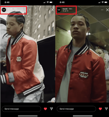
Instagram is testing a new User Interface (UI) for organic posts that will display only the first three stories as default. To see additional stories, users will need to click the “Show All” button under the navigation bar.
As a result, brands could experience a major decline of views and reach, assuming most people won’t click the “Show All” button. Fueled by TikTok’s rapid growth, this is a competitive move to increase engagement by incentivizing users to post more frequently — more posts equate to users spending more time on the platform.

Limiting the number of stories will also negatively impact organic story rate analytics, and users may miss details about your brand, features, or events.
Instagram Stories are meant to be spontaneous and in real time. This new feature would change that, spurring marketers to become more strategic regarding optimal posting times. For example, marketers may consider posting three Stories at a time or making the first three Stories the most impactful. While the three-story limit is already active for paid ads, marketers who adopt an immersive story approach will need to re-think their strategy.
We suspect this move is tied into Instagram’s Reels-first focus, which has also seen a launch test of a new, full-screen UI. This would incorporate feed posts, Reels and Stories in a single stream. Stories would then be shown with the frame count along the bottom of the screen, prompting users to swipe left to see more. Instagram may believe that including too many frames will be off-putting, taking users out of the vertical swiping experience.
While this new UI is merely being tested, it could be a sign of things to come as Instagram seeks to recover some users who’ve migrated to TikTok.
We will keep you apprised of these changes as they evolve. In the meantime, if you need assistance with your social media strategy, please contact us today. Our teams are here to help.


